Making a good first impression is critical for brands.
A business’s logo often shapes this impression. It can either encourage or discourage customers to trust and interact with the brand.
How should a powerful custom logo look? What is an effective way of using a logo creator? These are common questions in the world of design.
Nevertheless, this guide offers 6 tips for creating a logo that conveys a brand’s identity.
Need to hire a freelancer?
Hire elite freelance talent with WeSellTalent. From single gigs to large projects, our freelancers are ready to help.
Things to consider when you make a logo
As you ply the path of designing your own logo, you’ll realize that it takes more than throwing a few elements in.
Still, here are some things you must consider when designing a professional logo.
- Brand Identity
According to neuroscientists, the human brain can recognize an image within 13 milliseconds. That is about 60,000 times faster than the brain processes text.
Hence, a good logo is synonymous with a brand personality. Your logo must be appealing enough to attract prospects. Thus, a key consideration is deciphering the brand’s mission and target audience. This will eventually influence every element of the design.
- Logo Design Style
Deciding on the particular style for your logo is another key consideration.
Notably, there are different styles to choose from. Popular options include wordmarks, symbols, letterforms, emblems, and combination marks. The style you choose depends on the tone you want to set and what gives a sense of certainty.
- Originality and Longevity
These factors are critical in helping a brand stand out from competitors. You don’t want a complete copy of popular logos or a design that fades away quickly. The focus on originality and longevity helps develop distinctive, timeless designs that grow with brands.

6 Tips for an impressive logo design
The idea of solely relying on a professional designer for a logo is changing. This is especially true given the widespread availability of logo-making tools. As you build your company logo, here are some practical tips to help!
1. Consider the audience
Businesses must always make decisions with their customers in mind, including logo designs. Your brand logo must resonate with your target audience. If your clients don’t find it attractive or relevant, it is definitely a bad design.
So, how do you know the logo that your audience will prefer?
Here’s a simple trick: run a similar A/B test to what you’ll do in marketing campaigns. Try designing different logos and ask your target audience. Allow them to vote for their preferred design, and voila, you’ll find the best option.
2. Keep things simple
Most people go the extra mile to develop complex designs, forgetting the appeal of simplicity. First, businesses hope to remain engraved in the hearts of prospects and clients alike. That’s obvious!
Thus, the goal is to create a logo with elements that people can always remember.
Sadly, this becomes challenging if the logo has a complex design. Notably, people will always remember something as simple as the Swoosh of the Nike logo or the bitten apple fruit of the Apple logo.
Despite the need for simplicity, you don’t want a cliché design or something that screams “generic.” Such logos will not be memorable, giving competitors an edge over your brand.
3. Research and design with clarity
As you work on your logo concept, it is important to research famous logos, especially those in your industry. Understand how they visually communicate and the elements they often employ. Then, begin drafting your concept, comparing symbols, words, and colors.
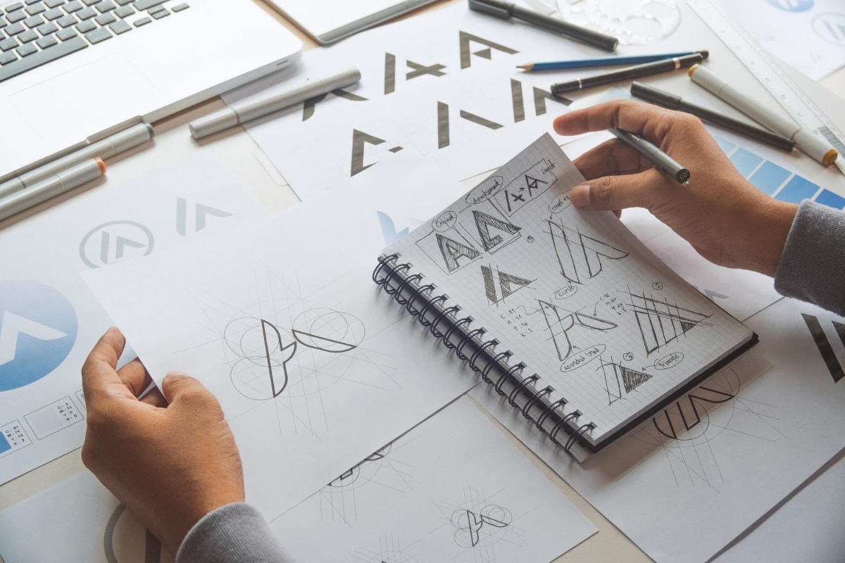
There should be a clear purpose as to why you’re adding each element. You can create as many sketches as you like; jot down every idea as you get inspired.
Although not all your sketches may be useful in the end, they will keep you out of a creative rut. Furthermore, ensure your design doesn’t say too much at once to avoid leaving customers confused.
4. Pick the right colors and fonts
It is important to choose colors and fonts that appeal to customers.
Using the right color combination is necessary, as it reveals the client’s emotional associations with specific brands.
As a trend, financial, tech, and similar companies that rely on trust have adopted the color blue. Meanwhile, pink, purple, orange, and similar bright colors are often used for entertainment brands’ logos.
You can make a specific color that you commonly use on your products, website, or social media pages. But remember, the fewer colors, the easier it is to print your logo.
Also, the typography is a critical element that complements your brand. Impressively, there’s an expansive collection of custom typography options available to logo designers. So, choose fonts that align with your business’s tone.
Notably, Serif fonts give a classic and slightly old-fashioned appearance.
5. Scalability and versatility
Businesses often advertise their products and services across various platforms. Whether it’s for your website, social posts, mobile prints or even billboards… You want your company icon to be visible.
Hence, it is important that you design adaptable logos that conform to different platforms. This requires thorough testing to ensure the brand’s logo remains attractive across different uses.
You don’t want the logo’s features to get lost when its size is reduced or to become illegible when it’s increased. The aim is to keep the icon the same and maintain its recognizable features at all times.
6. Seek feedback
You may have designed a “unique logo,” but skipping the feedback phase may be your worst mistake. Often, you may have missed certain insights, and it takes a colleague or a customer to point them out.
Be open to constructive critiques and possible revisions. Before adopting the logo for your brand, send it to relevant individuals for feedback. Then, incorporate their responses and suggestions to improve the design.

What do avoid when designign a logo
Having learnt some practical tips for designing a powerful logo, here are some things you must not do.
Avoid cluttering your logo design
As a symbol of your brand, ensure you don’t fill your logo with too many details. Doing so will always result in a messy design that will most likely leave people confused.
Kindly note that it’s fine to leave spaces rather than cramming too much information into a limited space. Instead, create a unique icon and later share this information with clients via your website or social pages.
Take care in implementing changes
It is fine for businesses to experiment and tweak certain logo features as their brands become popular. However, sudden or drastic changes can always affect how clients perceive your brand.
For instance, in 2010, Gap had replaced its classic blue box logo but faced customer backlash and had to revert to the old logo.
Sometimes, such changes could even result in financial losses.
A notable example is Tropicana’s sales dropping by 20% within two months of changing its “orange-with-a-straw” logo. So, a subtle change can go a long way, and it is best to push out logo changes carefully.
Do so in phases and observe how your customers perceive these changes before fully adopting the new icon.
Quit relying excessively on trends
Lately, there are many trends in the design world, but it is unwise to follow them blindly.
Such an action could backfire, especially since many trends only last a few months. Whether seeking modern looks or a contemporary inspiration, ensure you create something memorable.
Prioritize a logo that doesn’t disrupt your brand’s consistency and can stand the test of time. Doing so will help reduce redesign costs. Only slight adjustments for a polished appearance will be needed from time to time.
Too many colors are bad
Adding too many colors to your logo will give it an unprofessional appearance and reduce people’s ability to recognize it.
Preferably, you should stick to two or three colors to enhance versatility and brand cohesion. Settle for monochromatic designs for a minimalist approach, using different shades of a single color to spark visual interest.

How to use a free online logo generator
There are many online tools that can help you actualize your goals of creating a great logo. Notably, some of these tools support your design for free.
When using a logo maker, you can access customizable templates to push out outputs similar to those of a professional designer.
So, here’s how to use a free online logo generator.
1. Use a good logo generator platform
The first step is choosing a suitable free logo maker. While there are many logo generators, they don’t all work equally well. Hence, you must find one that serves your purpose and allows for a seamless design process.
2. Research your industry
While on the free logo generator platform, search for your industry or business name. Doing so will help you find suitable templates for designing your business logo.
You’ll most likely find options with varying characteristics. Ensure you go for one that matches your business tone.
3. Pick a suitable style
Ensure you settle for suitable logo styles. Access the colors, shapes, and quality, choosing options that resonate with your audience. Also, you’ll have to decide whether you want a modern or contemporary look, depending on your brand’s personality.
4. Customize and preview
Using the editor provided by the logo generator, prepare to design a custom logo. Adjust colors, fonts, icons, elements, and layouts.
On some of these platforms, certain features may only be available to subscribers. So check for free options, or get a subscription if needed.
5. Download your logo
After customizing, download your logo files. Often, downloading high-resolution files is better for maintaining design quality. Try different file formats (PDF, JPEG, PNG, etc.) and download options to find the one that works best.
Conclusion
A logo isn’t a mere graphic, but a representation of your brand and everything your business entails. As a result, it is crucial that businesses adopt powerful logos that resonate with their audience.
However, many people struggle to develop the right logo, which can lead to lost potential customers. So, it is important to focus on what strengthens your branding efforts.
Notably, a great logo is characterized by simplicity, distinctiveness, consistency, balance, and scalability. Be sure to keep these tips in mind, as they are helpful in designing a memorable logo.
